Educational designs have a feature: they often contain only one version of design (mobile or desktop) to not overwhelm students. This, client site of the cinema has only the mobile version.
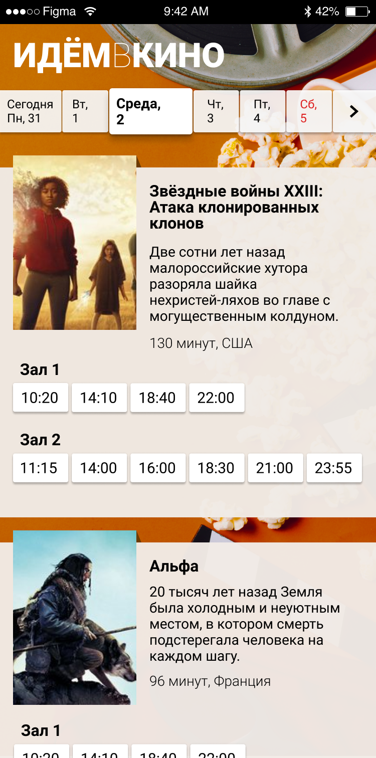
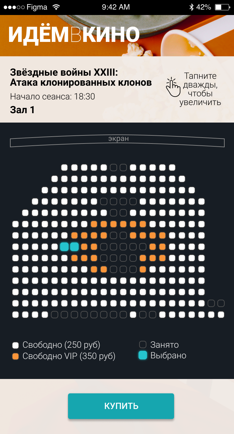
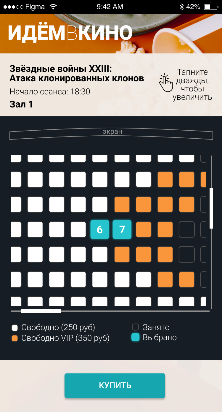
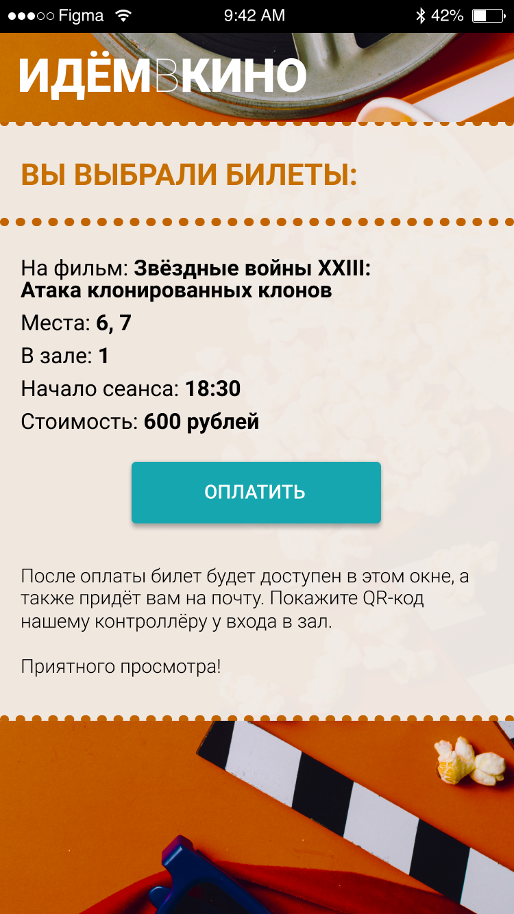
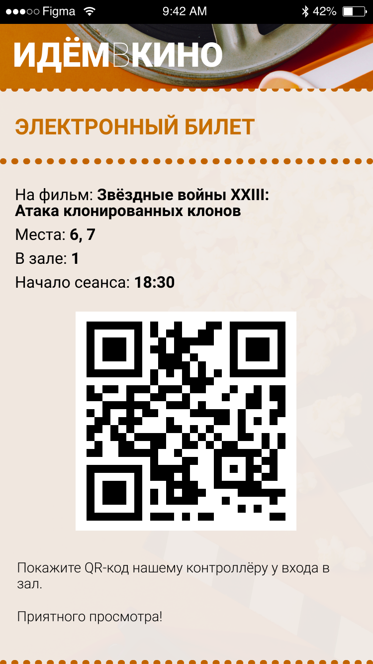
Future client takes 4 steps: choose a cinema session, pick a seat, pays for a ticket, receives an e-ticket. I developed a screen for each step.
My favorite part of it is a perforation of the ticket :)
It's close to impossible to work with a seats scheme without zoom, so I made a permanent hint about zooming gesture.
Payment is always done via side services, so I didn't design a screen for it.
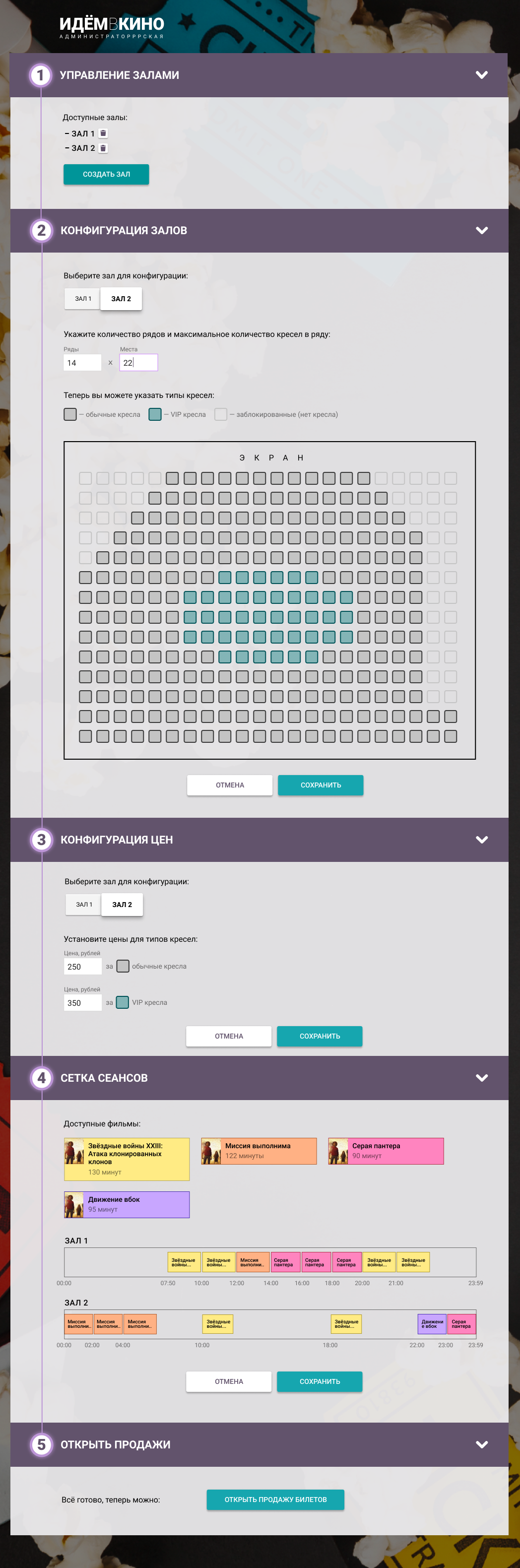
Admin part of the site has only desktop layout.
For running a cinema an admin needs such options:
- creating and deleting of halls;
- configure seat schemes of the halls;
- setting prices;
- adjusting sessions;
- starting and finishing ticket sales.
Technical note had this options in a numbered list and it defined my way of thinking: I made the admin part in step-by-step form.
If I was working on this project today, I would refused the step-by-step form and would offered a more convinient navigation.
Source code is availible in my repo.