Frontend developers have a joke: «I can work with a design on the napkin». This is exactly what happened to me here: at first I was brought a sketch done by an engineer with hand.
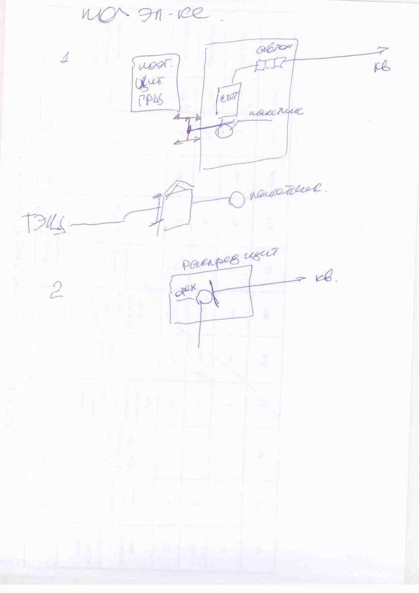
I believe that infographics are supposed to explain difficult things in a simple visual way. A direct digitalizing of the engineer's sketch couldn't fulfill this purpose. So I had to do my «homework», making myself familiar with the topic. It allowed me to make design decisions.
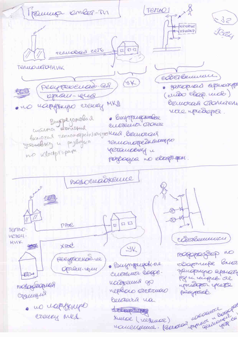
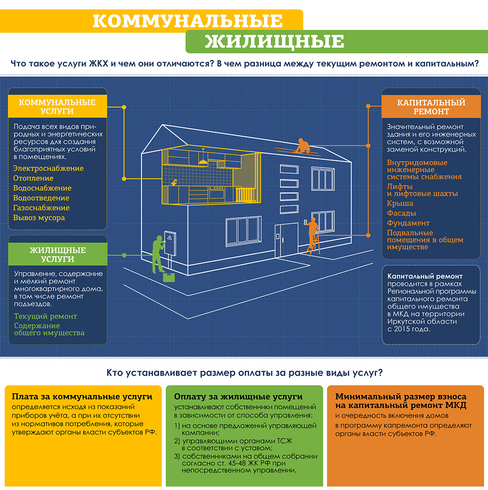
Next illustration explains how utility networks are divided between maintaners.
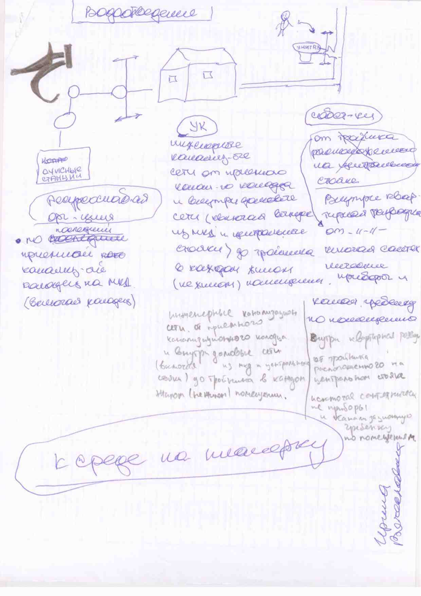
Thanks to the expirience I got working on the first infographics, I was able to interview a client properly to get all the information needed to create a second infographics faster and easier.
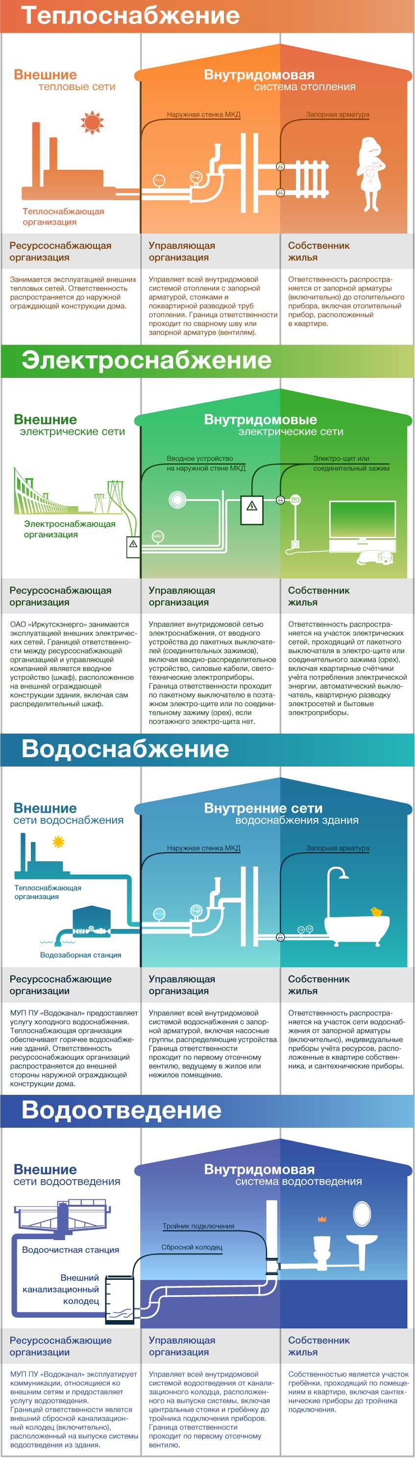
This illustration shows the difference between unitlity services from the law perspective.
Infographics are availible on the client site.