Utility Services Portal consists mostly of tables because it's made for exchanging data between citizens and utility services.
I was invited to this project to create lacking UI elements for the main page, such as a register form...
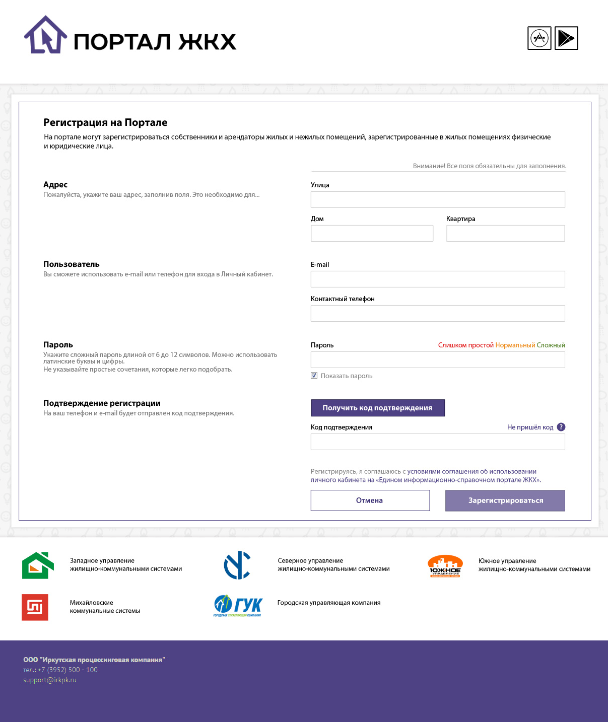
...or icon set for description section.
I designed inner pages relying on prototypes done be product manager and color palette made by previous designers.
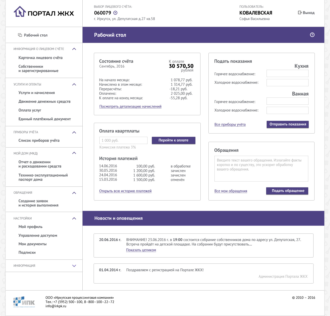
Here you can see a "Desktop" page. It is the first page a user sees after logging in. This page provides a quick access to the most popular functions.
Payment page, besides a payment form, had to include a billing history. Wide table defined the design of entire page, including the form. That's why summ and commission info are placed on the sides.
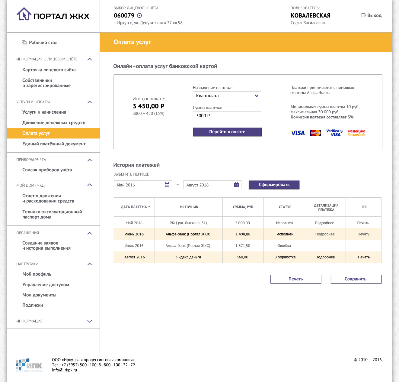
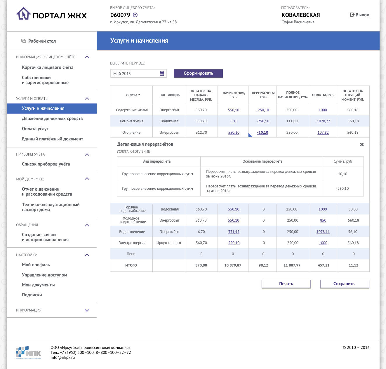
I had to make tables as readable as possible, because it was most demanded type of content.
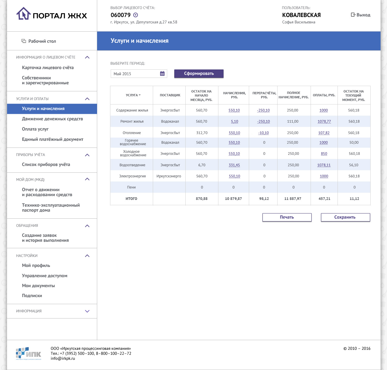
I also had to provide an option of showing commentaries to table vales. And these commentaries could also be tables! I decided to not use pop-op windows, and to show additional info inside the table itself.
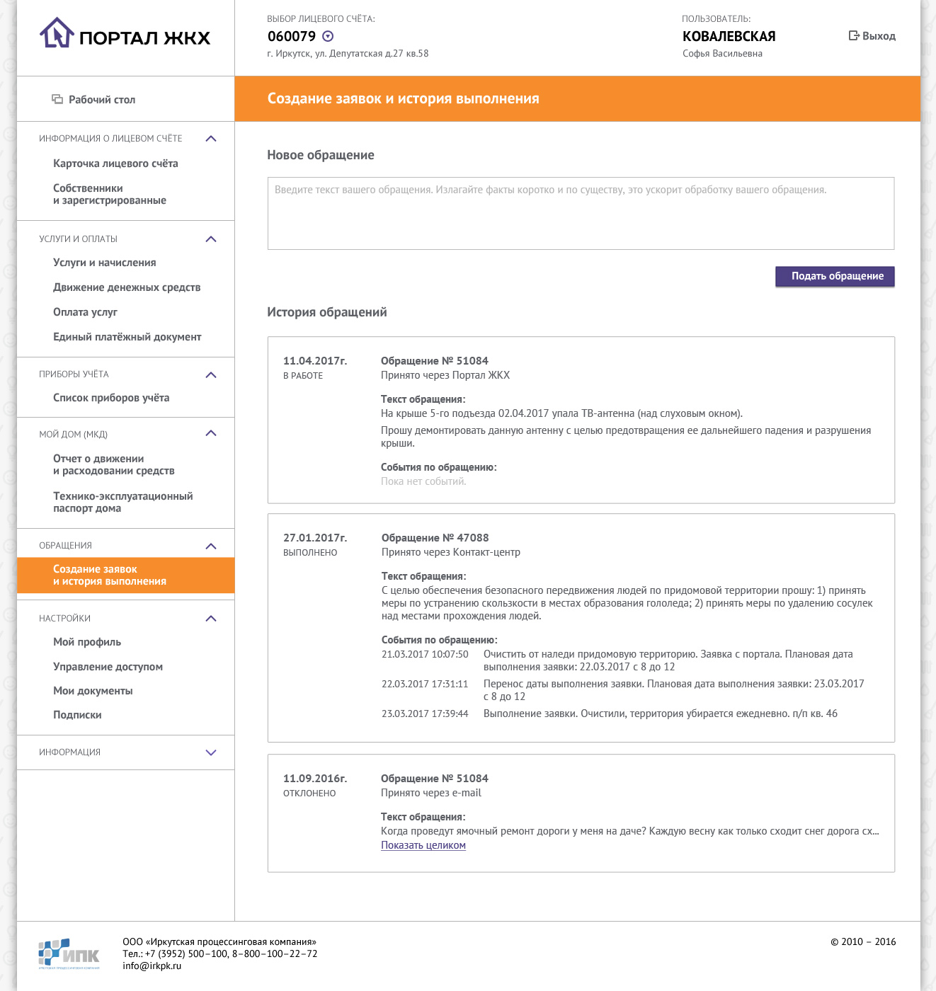
I would design the next page differently these days. The text field better be narrower, so it's easier to read the text inside it. In the message history I'd prioritize the text of the messages, not date or type.
Utility Services Portal was still in development when I left the company.